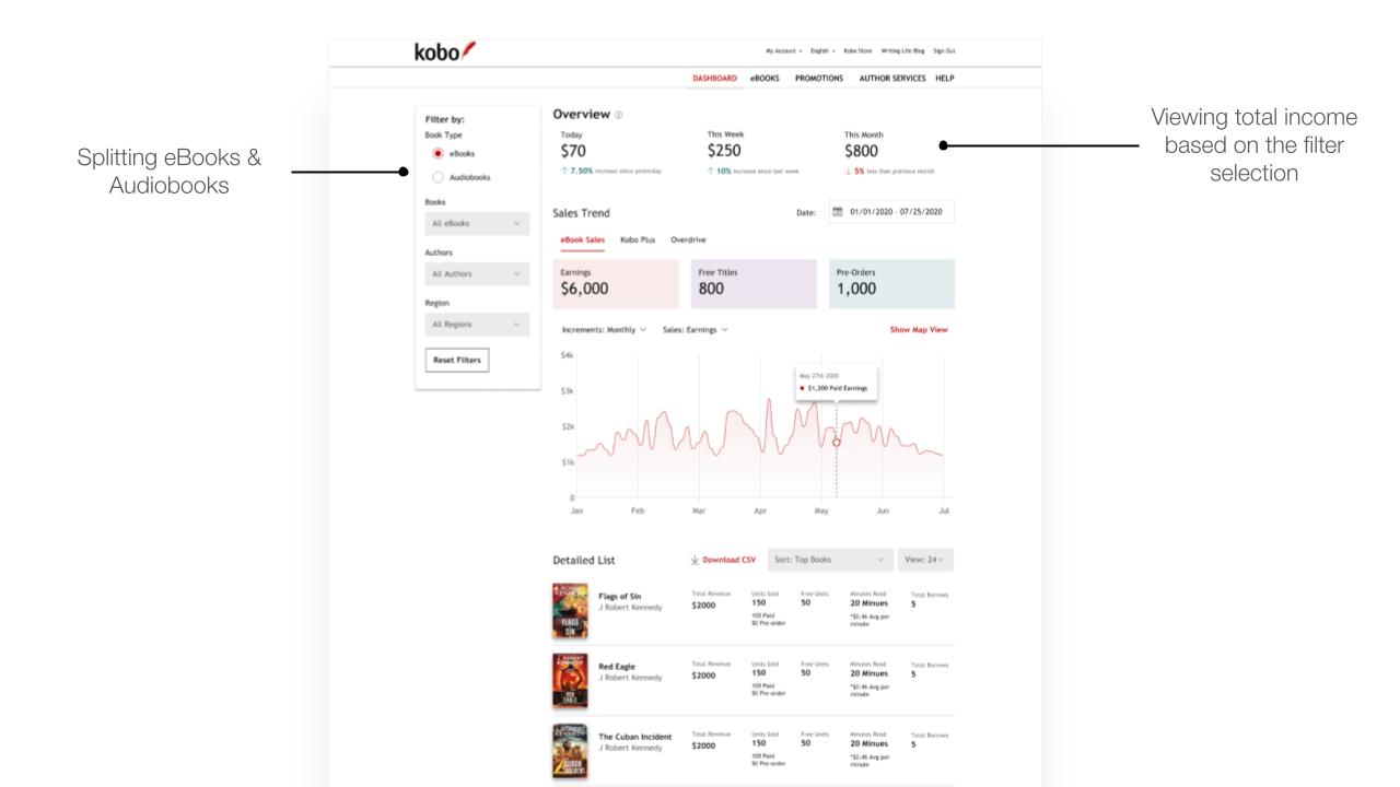
PROBLEM
Authors’ engagement with Kobo Writing Life is heavily influenced by their revenue. Research revealed significant hesitations surrounding the revenue data presented in the existing sales dashboard, hindering their ability to make informed business decisions and ultimately impacting their motivation to invest time and resources in the platform.
This led to the core problem: authors lacked confidence in the revenue data and struggled to understand the performance of their books across different distribution channels.

KEY FINDINGS FROM RESEARCH
PROCESS
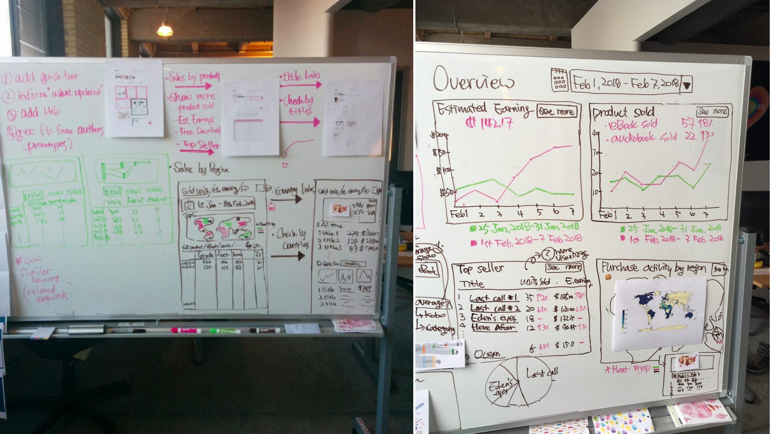
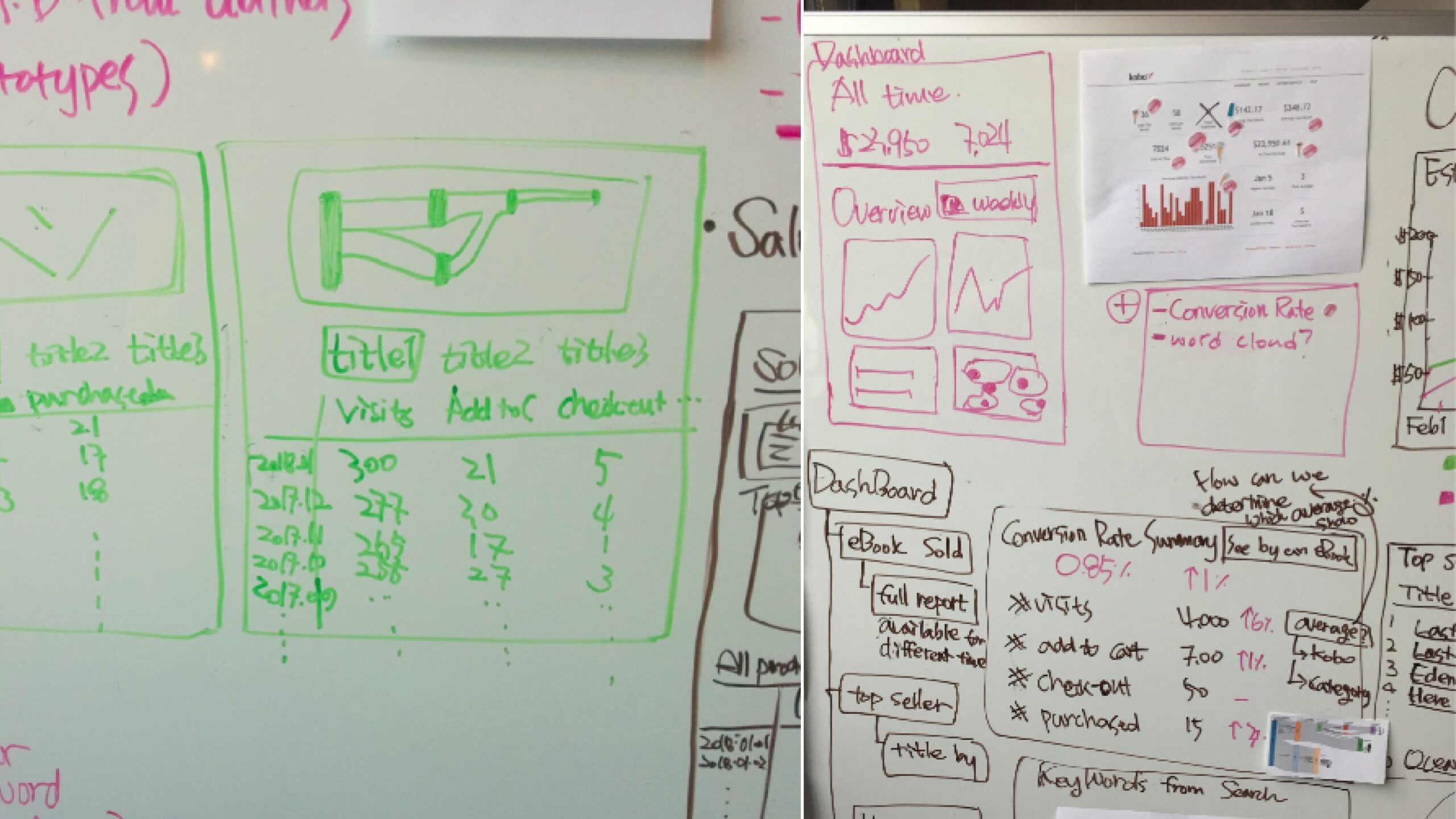
To address the challenge of providing authors with more control over their sales data, we began by mapping the problem and formulating “How Might We” questions. These included: “How might we let authors access data for all their catalog types?” and “How might we let authors customize what data they want to see?” Following this, we held a design studio to generate potential solutions for the dashboard redesign.

COMPARATIVE USABILITY TEST
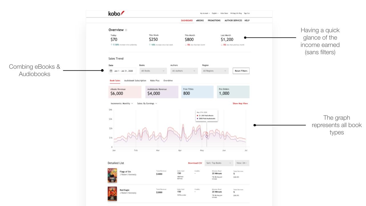
Conducted usability testing with authors to validate the chosen IA (comparing different informational structures: splitting it by the book type and the royalty type or just the book type) and evaluate the overall usability of the dashboard. Testing focused on clarity, discoverability, and ease of use.
NEW INFORMATION ARCHITECTURE
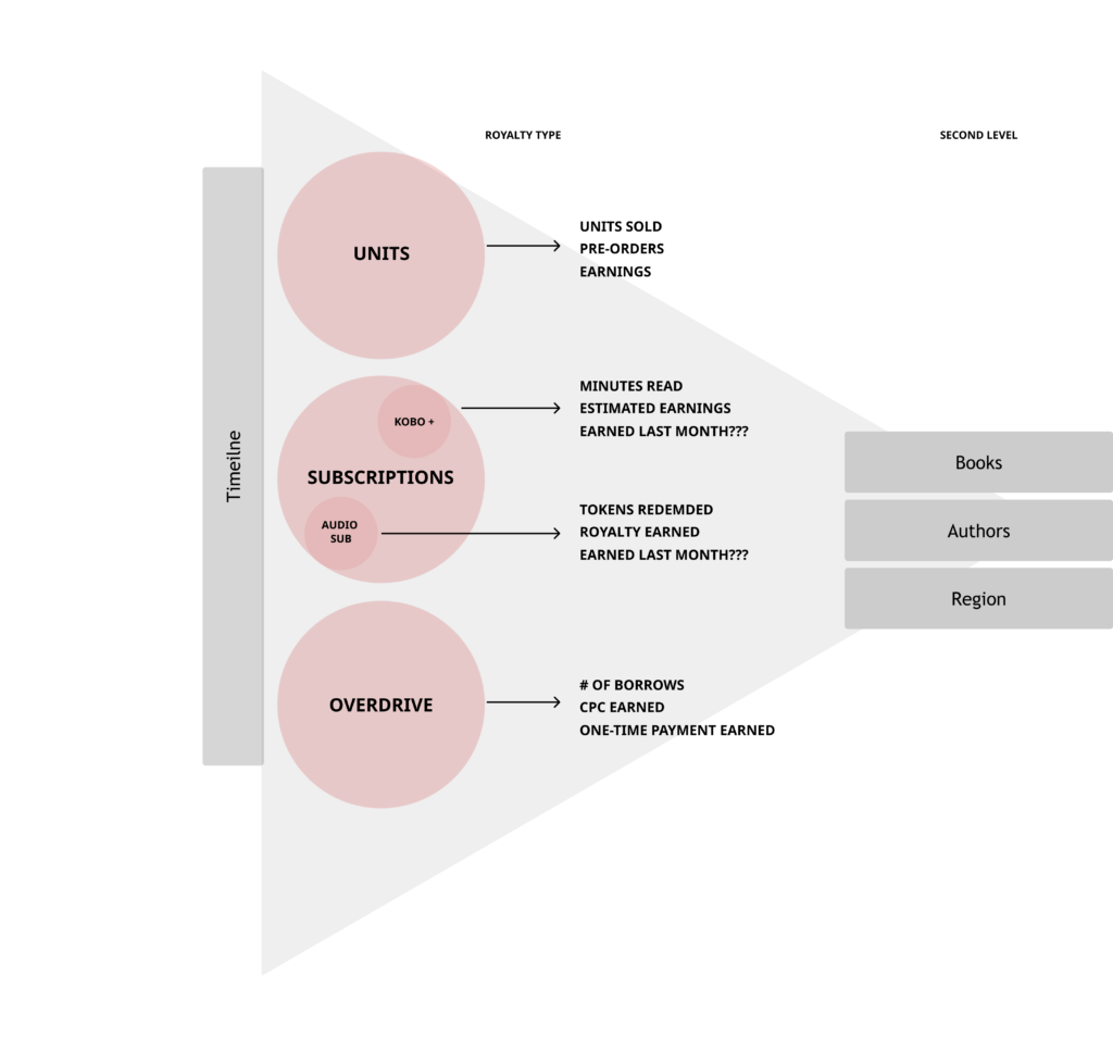
Based on the workshop I created this diagram to identify the information architecture divided in 3 levels: timeline, royalty type, granularity with books, region etc. One of the reason for this step to make the decisions on the specific data to show authors and build the necessary backend system.
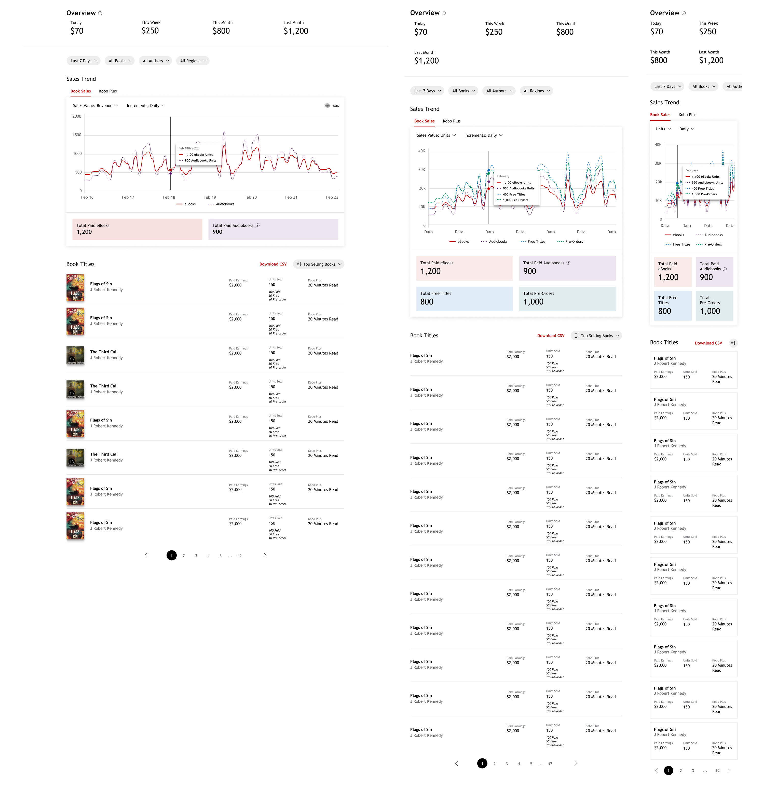
DESIGN DETAILS
OUTCOME
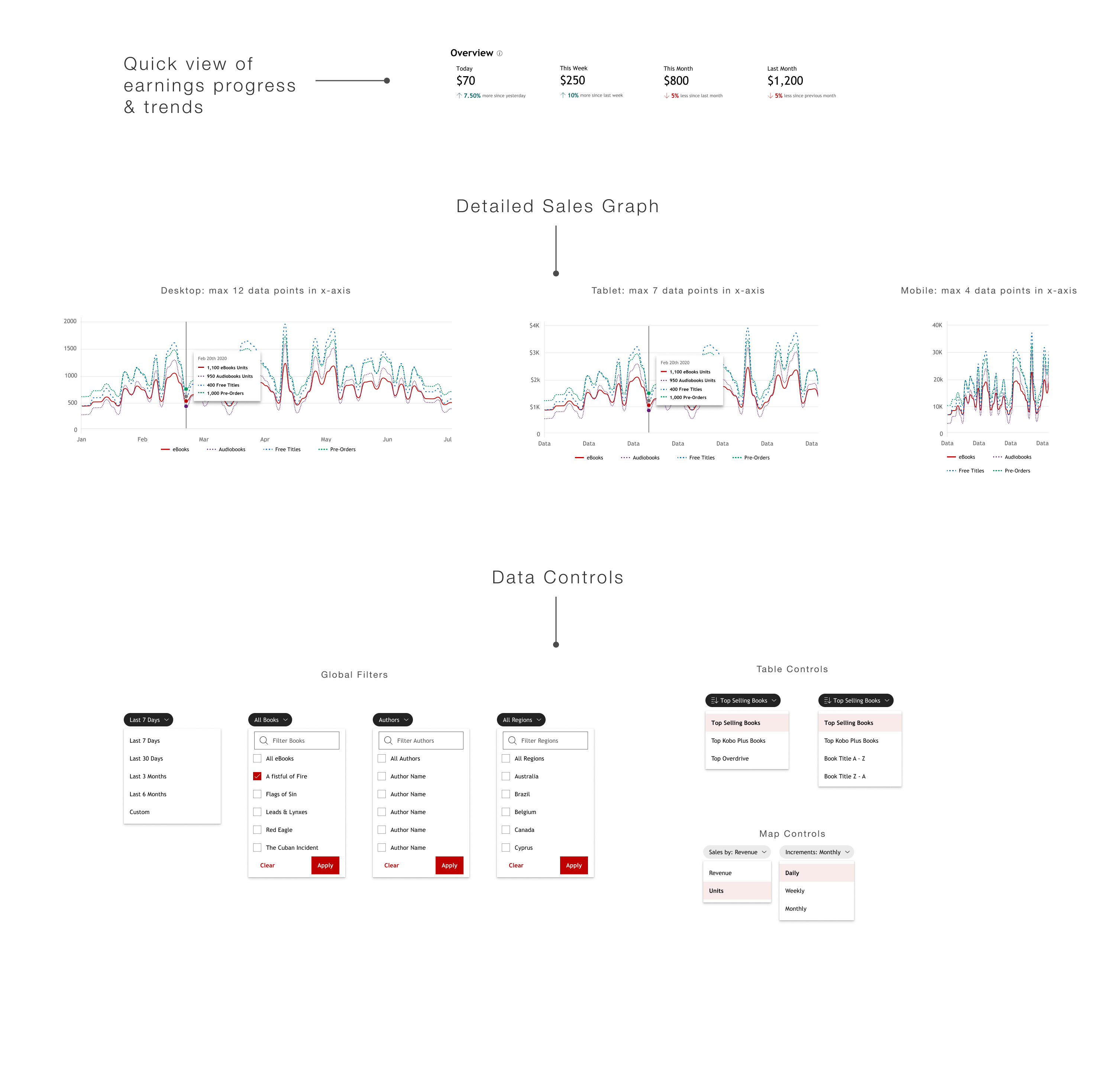
The beta release of the redesigned sales dashboard received positive feedback from authors.
“I’m loving the graph view! It made it so easy to get a sales overview.”
“I needed an accurate earnings view from today, this week, this month.”
“Downloading a CSV makes my life so much easier.”


